We explore the most common map projections of the world, how they work and which one is the best
Kia is usually described as the geek in our relationship. She’s the one with a computer science degree, she’s the one with the editor’s eye and she’s the Star Trek fan who describes herself as Seven of Nine… which is cool apparently? A friend of hers recently described her as “the one who puts the apostrophe in rock ‘n’ roll”.
That said, I have a few streaks of geek in me too. I’m a bit of a history nerd and can talk at great length about photography lenses and filters. But above all, I love maps.
One day, perhaps when we win the lottery and can afford a house with more than one bedroom, I will have a cartography room dedicated to my scores of Ordnance Survey maps, my collection of outdated classroom maps featuring names like Rhodesia and Bechuanaland (now Zimbabwe and Botswana), and my assortment of hulking atlases and creaking globes.
I love the way maps inspire conversation. Even with a solitary map on a meagre wall in our London flat, I saw how people paused, observed and asked curious questions like ‘why isn’t the equator in the middle?’ or ‘how come Greenland looks smaller?’.
The answer lies in the engaging topic of map projections. Allow me to elaborate.
Why do we need map projections?
In a perfect world, Earth would always be represented as a sphere (or more accurately as an oblate spheroid or ellipsoid). However, a globe is not practical. It can’t be easily carried, transported or kept in your pocket.
It’s not suited to large-scale use such as finding directions in a city or following a hiking route where a more detailed image is essential.
On a curved surface, measuring terrain properties is difficult, and it is not possible to see large portions of the Earth at once. Globes also do not function well on our smartphones, tablets and computer screens.
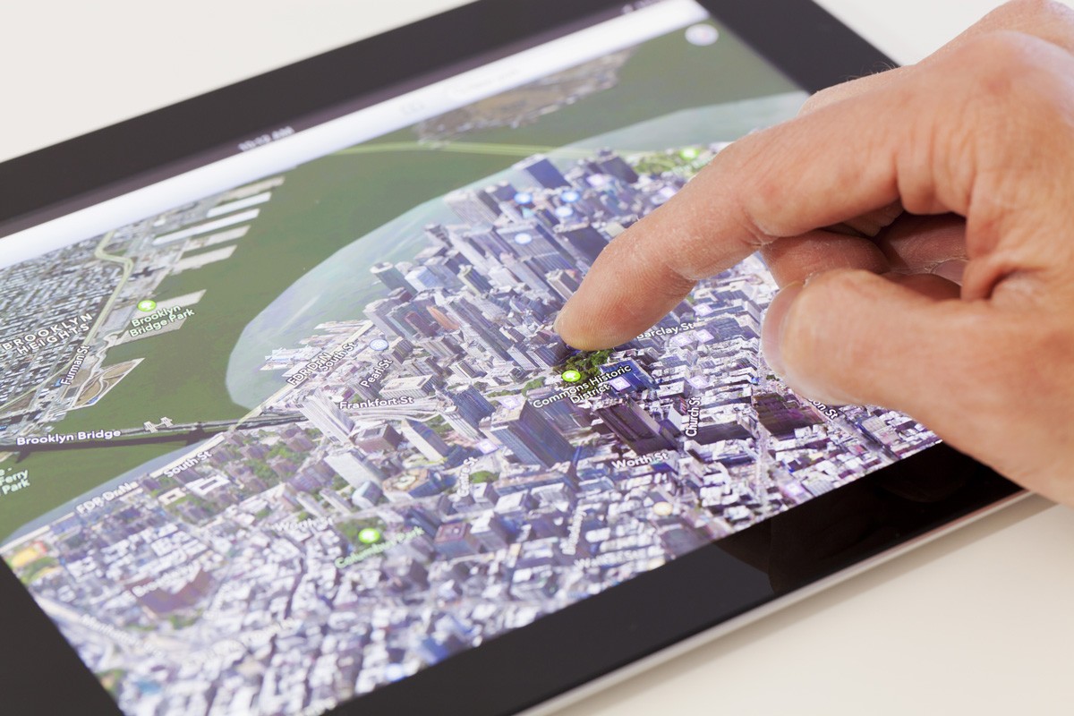
The above issues make globes expensive to produce, especially in varying sizes and scales, and impractical for everyday use. Hence, we create maps.
Be they paper form such as foldout, booklet or atlas, or digital formats embedded in websites and applications, we create two-dimensional projections of the spherical earth.
What is a map projection?
In its simplest form, a map projection is the transference of Earth’s curved surface (or a portion of) onto a flat surface by using mathematical equations: making the three-dimensional two-dimensional – or, making the curved world flat.
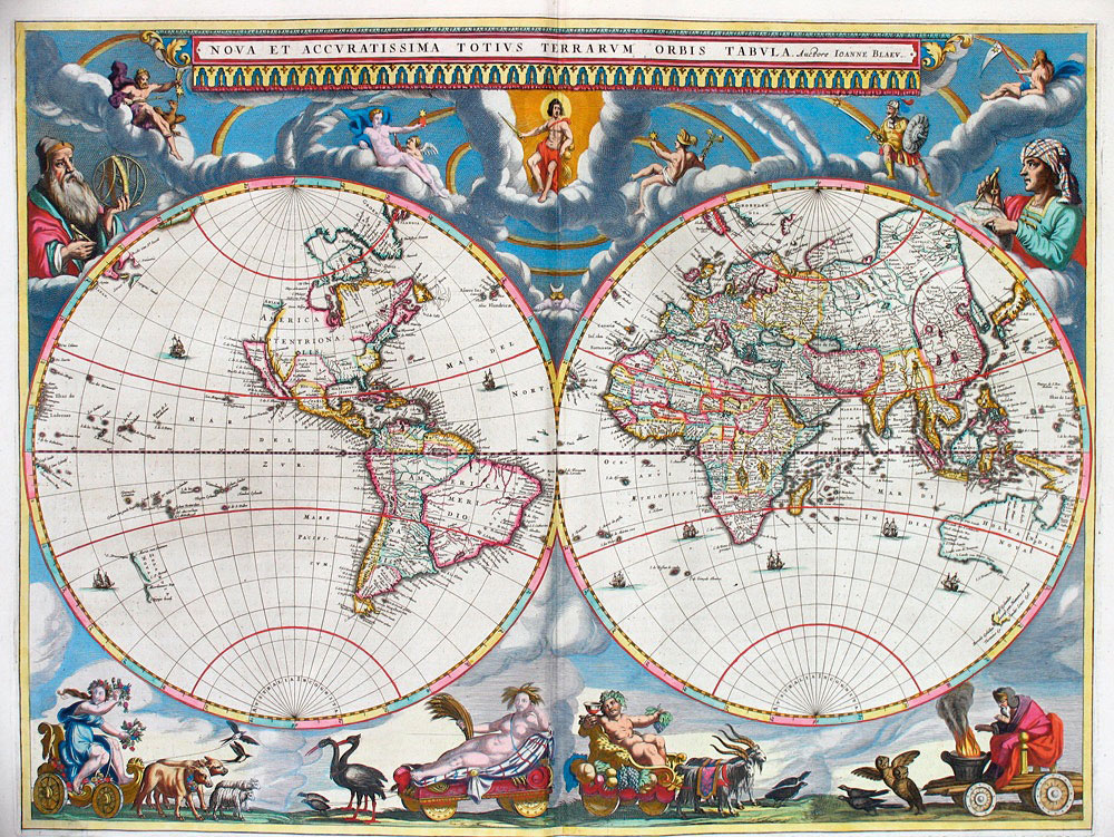
During such transformation, latitude and longitude lines are converted to Cartesian coordinates (x, y) representing position of points on a flat map. During this process, distortions must take place – it’s impossible for them not to. Depending on the purpose of the map, some of these distortions are acceptable while others are not.
A map projection is classified depending on the type of mathematical formula used to project the spherical globe onto the flat map. Map projections preserve some of the properties of the sphere at the expense of others, producing maps that appear to depict the world in different ways.
Basic types of map projection
The best way to describe how a map projection works is by imagining a piece of paper (the map) being laid over the Earth (or a globe) to obtain the latitude and longitude lines for the map.
Where the piece of paper touches the globe there is no distortion on the map; it is an exact reflection of the globe. However, where the paper is not flat, distortion takes place. The further the paper is away from the surface of the globe, the greater the distortions.

The maths in different projections attempt to overcome this problem – but none remove all distortions. Broadly speaking, there are three basic techniques used to create a projection and, therefore, a map.
Azimuthal: This piece of paper is laid flat touching a globe at a point – typically a pole, but not always.
Conical: The paper is rolled into a cone shape and touches a globe on a circular line. Typically, the tip of the cone is positioned above a pole.
Cylindrical: The paper is rolled into a cylinder around the globe, touching the Earth on a circular line – usually at the equator.
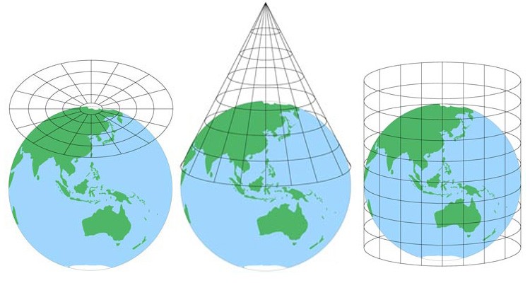
There’s also Pseudocylindrical. This is essentially the same as cylindrical but with the advances in computer modelling, it became possible to calculate the lines of longitude as curves, thereby reducing distortions near the poles. It’s also my favourite type.
Common map projections
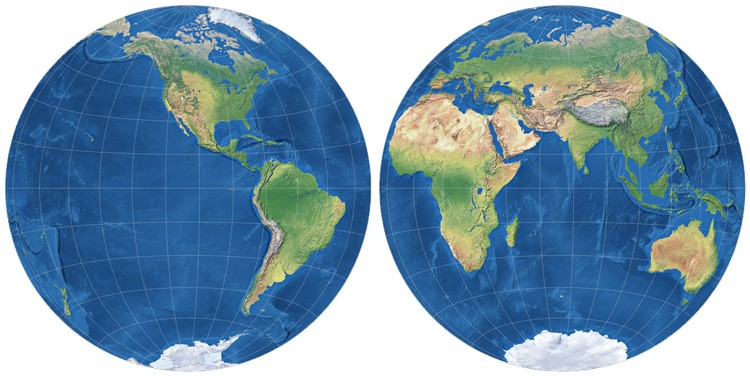
Azimuthal stereographic: The oldest form of map projection may date back as far as the 2nd century BC. The oldest known record of this projection is from Ptolemy in about 150 AD. The stereographic is the most common form of azimuthal projection still in use today.
The attraction of the projection is that the Earth appears as if viewed from space – or a globe. Shapes of landmass are generally well preserved, although extreme distortions occur towards the edge of the map.
Mercator: In 1569, Geradus Mercator created the most famous and most recognisable map projection and it is still widely used today despite its huge distortions.
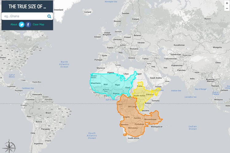
It is the reason Greenland looks the size of Africa on Google Maps. Nearest the equator there is little distortion. Distances along the equator are always correct, but nowhere else.
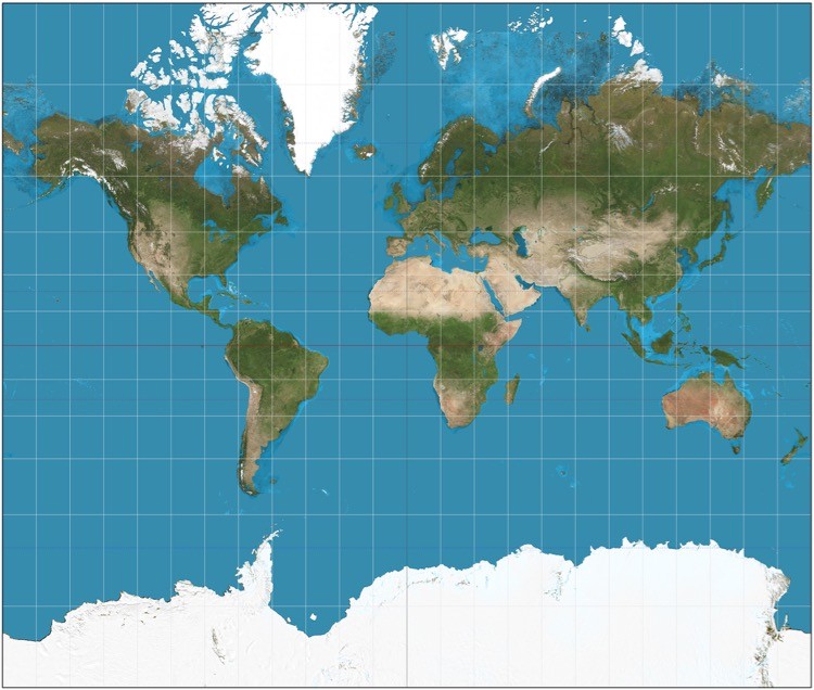
It became the standard map projection for nautical purposes because of its ability to represent lines of constant true direction – vitally important in an era when sailing ships and navigation was based on direction only!
Take a look at thetruesize.com to get a taste of how the Mercator projection (and Google) distorts our worldview.
Gall stereographic: In 1855, clergyman James Gall presented a map that intended to resemble the Mercator but with less distortion of scale and area near the poles. The cylindrical stereographic projection, based on two standard parallels at 45° north and south, passed unnoticed when it was announced.
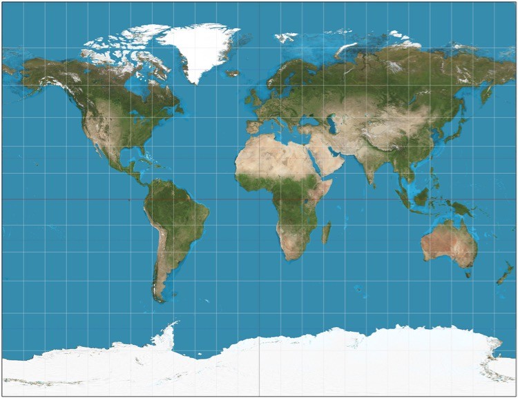
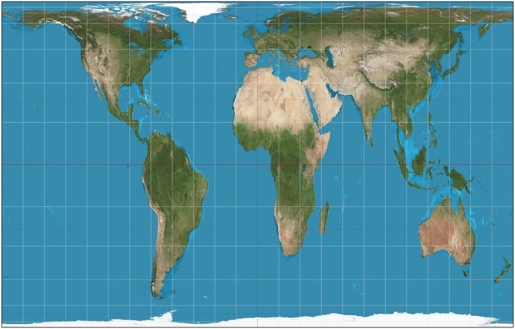
Gall–Peters: In 1973, filmmaker Arno Peters presented a cylindrical world map based on the map by James Gall above. Unlike the Mercator projection, Africa is represented at its true size: 14 times larger than Greenland.
It is a development of Peters’ earlier work. Like Gall’s, the map sets latitudes 45° north and south as the regions on the map that have no distortion.
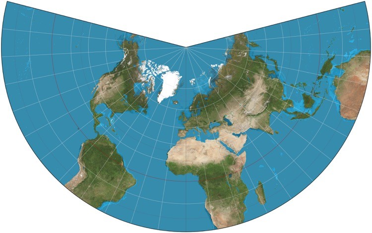
Lambert Conformal Conic: In 1772, a French/German mathematician and scientist called Johann Heinrich Lambert released seven map projections! Considered revolutionary for its time and still important today, his Conformal Conic map projection has become a standard for mapping large areas at a small scale in the mid-latitudes such as USA and Europe.
It’s not very good for the southern latitudes which usually get cut off somewhere around 30° south.
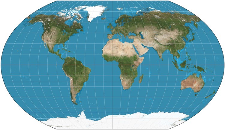
Robinson: Ahhh, my favourite map projection. I like the Robinson because it is more accurate and more attractive than the Mercator. The map was devised by Arthur H. Robinson, an American geography professor, in the 1960s because modern mapmakers had become dissatisfied with the distortions inherent to the Mercator projection and wanted a world projection that felt more realistic.
As such, the Robinson projection has become more popular than the Mercator.
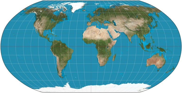
As it is a pseudocylindrical projection, the Standard Parallel is at the equator and still has similar distortion problems as the Mercator projection. However, the range of acceptable distortion is expanded from 15° north and south to 45° north and south.
There is also less distortion in the polar regions. Unlike the Mercator, the Robinson has the lines of latitude and longitude evenly spaced on the map.
Enjoyed this post? pin it for later…
Recommended reading:
Prisoners of Geography: Ten Maps That Explain Everything About the World
All leaders of nations are constrained by geography. Their choices are limited by mountains, rivers, seas, and concrete. To understand world events, we often focus on people, ideas, and political movements, but without geography, we never have the full picture.
The Revenge of Geography: What the Map Tells Us About Coming Conflicts and the Battle Against Fate
In this provocative, startling book, Robert D. Kaplan, the bestselling author of Monsoon and Balkan Ghosts, offers a revelatory new prism through which to view global upheavals and to understand what lies ahead for continents and countries around the world.
